
What if logging into your favourite app felt like stepping into a holographic city, where dashboards hover mid-air and every click moves you through a living, digital world? That’s the kind of experience designers create right now through metaverse web design and the latest Web3 UX trends.
But while Web3 and immersive tech continue to grow, designers face a real challenge: how do you make an interface feel intuitive in a space that doesn’t behave like a typical website? The usual grids, buttons, and menus don’t quite hold up when users want movement, depth, and control over their data. And that’s exactly when things start to fall apart for most digital experiences.
In this post, we’ll explore the future of user experience, highlight what designers need to get right, and point out the common traps to avoid. You’ll get practical ideas, real examples, and a fresh perspective on what it takes to design in this next-gen digital space.
Ready to see what tomorrow’s web could feel like? Read on to find out.
Why Web2 Design Doesn’t Work Anymore
Web2 design was built for screens, with static layouts, scrollable pages, and familiar forms. That structure worked well when users simply browsed, tapped, and moved on.
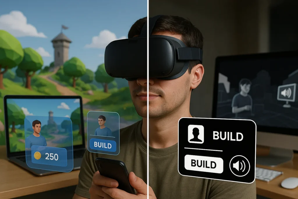
Nowadays, things are different. Web designing in the Metaverse is a totally different game. Interactions now happen in layered environments where presence, movement, and engagement are part of the flow.
Flat interfaces start to break when you apply them to spatial systems. Picture someone inside a Decentralised Autonomous Organisation (DAO), a blockchain-based group that makes decisions through community voting and smart contracts. Instead of tapping through tabs, a user might navigate a 3D governance hub, interact with floating proposals, or move through virtual rooms to access different functions.
Standard web design patterns aren’t made for that. New design approaches need to align with how people experience space, tools, and motion in cyberspaces. Buttons can become gestures. Menus can feel like portals. The interface becomes part of the world rather than something layered on top.
These changes are remodelling expectations for the future of user experience. To meet them, design needs to feel natural, responsive, and built for comfortable interactions.
Designing Playful UX for the Metaverse: How Engagement Drives User Experience
Designing for the metaverse means thinking less like a web designer and more like a world builder. When people enter these spaces, they’re moving, exploring, and reacting. This transformation calls for UX that feels playful but still delivers clarity and purpose.
Here’s how that looks in practice.
Active User Roles in Metaverse UX Design
In virtual worlds, you jump straight into the action. You build your avatar, make real choices, and watch how your decisions impact everything around you. This forces designers to completely rethink their approach.

Interfaces have to let users feel like they’re in charge. When you get it right, people start to immerse themselves in the experience, and every click and gesture starts to feel meaningful.
Using Gamification to Improve Metaverse User Experience
Metaverse platforms use progress bars, unlockable content, and environments that change as you interact with them. Many successful platforms take these ideas straight from gaming. These features hook users and give them reasons to keep coming back.
For instance, Duolingo nailed this approach by turning daily language practice into a reward system. The same logic can work here, encouraging consistent, deeper engagement.
Accessibility in Metaverse UX: A Design Essential
When you create your metaverse experience entirely depending on hand controls or what people can see, you are forgetting about users with disabilities. This raises questions about accessibility, and it needs to be an integral part of the experience. To fix it, you can include voice commands, keyboard shortcuts, audio cues, and vibration feedback to close the gap.
In our experience, virtual spaces feel enjoyable and meaningful only when they connect with people. Since users genuinely want to spend their time in these environments, the means of navigating through these spaces should never be an issue.
Pro Tip: Start your design tests with a screen reader and keyboard-only navigation. It highlights gaps before real users ever feel them.
Web3 UX Trends & Mistakes Designers Need to Know
Designers creating Web3 experiences are getting some things right. Clean wallet flows and immersive interfaces are becoming more common, but many still miss the mark on usability and trust. While some trends are improving how users interact with decentralised platforms, others are unintentionally driving people away.
Current Web3 UX Trends That Improve User Experience
These approaches are helping users move confidently through decentralised environments:
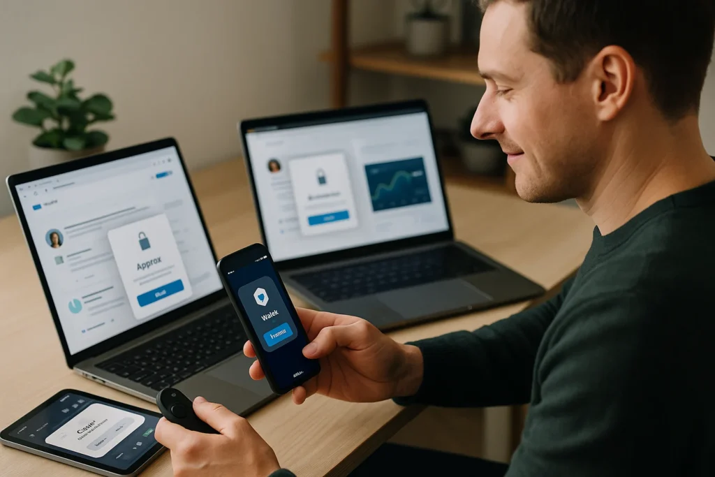
- Intuitive wallet integrations: Tools like MetaMask and WalletConnect are now built directly into the interface. This removes extra steps, speeds up onboarding, and keeps users from dropping off early in the process.
- 3D interface layouts and object-based navigation: Instead of traditional menus, users interact with visual elements placed in space. This creates a more natural and immersive way to explore platforms inside the metaverse.
- On-chain identity design: Platforms are starting to support portable, blockchain-based identities. This means users can sign in, hold preferences, and access services without constantly re-registering. It saves time and builds trust.
Common UX Mistakes in Web3 Design to Avoid
Even well-intentioned designs can push users away when they overlook basic usability. Let’s see some examples here:
- Overcomplicating onboarding: Most users don’t want to learn about blockchain just to sign up. If the first steps are filled with jargon or unnecessary actions, they’ll leave before they start.
- Skipping feedback loops: Without confirmations or loading indicators, users feel unsure if their actions went through. That’s a serious problem when money or assets are involved.
- Missing trust markers: Visual cues like open-source badges, smart contract audits, or community ratings help reassure users. When these are missing, platforms feel risky or unpolished.
Case Study: Simplifying UX with Progressive Disclosure
We worked with a decentralised finance (DeFi) app that kept losing new users during the sign-up process. Their mistake was dumping every feature on people right away.
But once they switched to showing features one by one based on what users needed, people stopped getting overwhelmed. They could finish what they started, and the whole experience felt less intimidating.
Web3 UX design changes quickly. The best apps make things simple and help users feel confident about what to do next. And when you get this right, people who just visit once will keep coming back and actually use your platform.
Designing for Decentralisation: What It Means for UX
Designing for decentralisation means shifting power and control from central entities to individual users. In a Web3 context, this requires rethinking how people access services, manage data, and interact across platforms.
The experience needs to feel intuitive and trustworthy, even when there is no single system running the show behind the scenes.
Let’s break down what that looks like and the design challenges that come with it.
What Decentralisation Looks Like in UX
To design effectively for Web3, you need to understand how decentralisation shows up in the interface. It involves how users interact, what they control, and how they build trust with a product.
In practice, decentralised UX is built around three main ideas:
- User control: People decide how their data is used and who gets access to it. Interfaces must include permission prompts, privacy tools, and clear communication around data sharing.
- Permissionless access: Users can join and use the platform immediately, without going through lengthy sign-ups or central verification. Design needs to reduce friction while still guiding new users.
- Persistent identity: One wallet or digital ID can be used across multiple platforms. This requires thoughtful UX so users understand what is carried over, what isn’t, and where their data lives.
UX Design Challenges in Decentralised Environments
Designing without a central authority or shared backend creates hurdles that don’t exist in traditional platforms. Here’s where it gets tricky:
- No central databases: Interfaces must pull information from distributed sources like wallets or nodes. This can lead to longer load times, syncing issues, or inconsistent data if not designed carefully.
- Modular, shifting ecosystems: Web3 apps are usually made of parts that evolve independently. UX needs to stay consistent even as different components update at different times.
Community-Led Interface Decisions
In decentralised apps, users get a say in how things look and work. Through DAOs, Discord channels, and community forums, people share feedback and vote on design updates. This makes users feel more connected to the product.
However, it also means you have to balance everyone’s input without making the app feel messy or broken with constant changes.
Example: Marketplace UX
Amazon offers a tightly controlled, streamlined shopping experience. OpenSea gives users transparency, ownership, and choice, but the experience can feel rough around the edges. This contrast shows how decentralised marketplaces prioritise freedom but oftentimes struggle to match the usability of centralised platforms.
Designing for decentralisation means helping users feel confident and in control without overwhelming them. As Web3 UX trends continue to evolve, the real challenge is making openness simple enough for anyone to use.
Bridging the Knowledge Gap: Educating New Users in Web3 UX
Most users arrive on Web3 platforms ready to explore, but vague language and poor guidance leave them stuck. So, educating users in Web3 is a fundamental part of the experience. Without it, even the most innovative platforms will feel intimidating or broken.
However, if the design teaches as it goes, users feel supported rather than dumbfounded.
Why New Users Abandon Web3 Platforms
Newcomers face friction early on. These common issues push users away before they even begin.
Crypto jargon overload
Terms like “staking,” “liquidity pools,” or “gas fees” can stop users in their tracks. Most people aren’t familiar with blockchain terms, and throwing them in without explanation makes platforms feel closed-off or too technical.
Interfaces that assume too much
Some Web3 products are designed for seasoned users. They skip steps, rely on prior knowledge, and use cryptic icons. This leaves first-timers guessing, clicking aimlessly, or giving up altogether.
No in-platform guidance
Without clear direction, users don’t know what to do next. Buttons might be there, but their purpose isn’t obvious. Without a hint or walk-through, even simple tasks like connecting a wallet can feel like a dead end.
UX Solutions That Guide and Support
Design can step in and teach without making users feel like they’re back in a classroom. A little help in the right place builds confidence fast. Here’s what can be done:
Layered onboarding
Instead of front-loading all the information, display actions gradually. This gives users room to focus, learn, and build momentum without feeling overwhelmed.
Embedded explainers
Short, friendly tooltips or inline text can define tricky terms or explain what a button does. When placed at the right moment, they prevent confusion and encourage exploration.
Interactive walkthroughs
Click-by-click guidance through important tasks helps users complete actions without trial and error. These should feel like hands-on support instead of a scripted tour.
Thoughtful empty states
This is often overlooked, but blank screens can feel like a roadblock. If you fix this small issue, it could easily increase user retention.
Here’s a tip: Add helpful prompts that suggest next steps or direct users to key actions. This small tweak makes the platform feel more alive and responsive.
If Web2 was like learning to drive, Web3 is more like flying a drone. It takes a little extra guidance up front, but once users get the hang of it, the possibilities open up fast.
Pro Tip: A/B test beginner and advanced flows. Segmenting by experience level lets you meet people where they are and helps both groups move forward without friction.
Accessibility in the Age of Immersion
Accessibility means making sure everyone, regardless of ability, can use and enjoy a digital product. In immersive spaces like the metaverse, this becomes even more critical. Interfaces are no longer flat and static. They move, react, and surround the user.
Without thoughtful design, large groups of people can be excluded right from the start.
Why Accessibility Gets Overlooked in Immersive Design
3D and VR platforms often focus on visuals, motion, and interaction. It’s because developers usually assume everyone can use motion controllers, follow visual cues, or stay comfortable in dynamic environments. However, these assumptions unintentionally shut the door on users with visual, auditory, or cognitive differences.
What Inclusive Metaverse Design Should Include
Accessible design in immersive environments means planning for a wider range of needs right from the start. Let’s take a closer look at what that involves:
- Colour contrast for VR goggles: Strong contrast between text and backgrounds makes it easier for low-vision users to read and navigate. Thin fonts and washed-out visuals should be avoided.
- Haptic and audio feedback: For users who can’t depend on visual cues, sound and touch provide important information. Properly mapped haptics and clear audio can guide users through interactions.
- Alternatives for motion-sensitive or neurodivergent users: Some users experience discomfort or disorientation with rapid motion, flashing lights, or complex transitions. Offering static modes or reduced-motion settings helps make the space more comfortable.
Who’s Working on This Now?
Groups like XR Access and Equal Entry are leading efforts to make VR and immersive tech more inclusive. Their work highlights both best practices and areas that still need improvement, bringing awareness to developers and platforms alike.
Mini Tip: Test your designs with a screen reader, even in VR. It helps reveal problems that visual testing alone commonly misses.
Ethical Web3 UX Design: Building Trust Through Transparency
Nowadays, designs guide where to look, and influence what you think. They can push you toward certain choices. And when people are dealing with their money, personal info, or online reputation, that kind of impact becomes extremely powerful.
For this reason, good ethical designs are important. They protect users from manipulation, build trust, and keep things fair for everyone.
How UX Design Influences Behaviour in Web3
Interfaces define user actions in subtle but powerful ways. In Web3, even a small visual cue or button placement can lead to unintended outcomes.
Designs that push users toward specific actions, such as defaulting to higher gas fees or skipping confirmation screens, can cause harm. Nudges must be used carefully. They should guide with clarity instead of manipulating through omission or misdirection.
Dark UX Patterns in Decentralised Applications
When decentralised apps cut corners on clarity, the risks grow. Since users manage assets directly, poor design can lead to real losses.
Some decentralised apps (dApps) conceal vital details. Fees show up at the last moment, or vague labels like “Confirm” mask complex transactions. Users are left exposed, unsure of what they have approved or paid for. Clear labelling and transparent steps prevent these issues before they start.
Transparency in Web3 UX: Why It Matters
When users can see what is happening, they feel more in control. It creates trust and improves retention.
Display fees, permissions, and data access upfront. Use plain language in place of technical shorthand. Structure screens wisely so that important actions are easy to understand and hard to miss.
Transparency in small interactions adds up over time.
Open Source Design and Community Input in UX
Trust grows when the design process is open to scrutiny and community participation.
We recommend that you invite users to give feedback and publish version histories and design rationales. You can also support third-party audits that examine UX flows for fairness and clarity. These practices build accountability and help teams spot issues early.
Ethical Web3 UX is more of a safeguard than a guideline. Every clear label, every transparent step, and every honest interaction helps users feel confident in unfamiliar systems. That is what turns casual users into long-term participants.
Where Web3 Design Goes From Here
Web3 and the metaverse are already changing how people interact online.
Throughout this post, we’ve covered the limitations of Web2 design, the rise of immersive and decentralised environments, and the growing responsibility designers hold. And issues like gamification, onboarding, accessibility, and ethical design are central to creating experiences that users can trust and operate with confidence.
If you’re building for the future of the internet, now is the time to reassess how your product supports real people in these unfamiliar environments.
For more ideas, practical insights, and future-focused design thinking, head over to The Demo Blog. The next generation of the web will be moulded by the decisions we make today. Let’s make them count.